HelloToby — Design System & UI Library for a Two-Sided Marketplace
PROJECT TYPE
UI Design
SECTOR
Service Platform
YEAR
2017
TEAM
UI Designer - Kassie Lo
MY ROLE
Build UI library and design UI for new features
OVERVIEW
DELIVERABLES
HelloToby is a community-driven marketplace connecting people who need work done with the professionals who do it. When I joined, the product was an MVP built to prove the model, not to scale — and the company wanted to expand the app fast.
There was no design system. Screens drifted off-brand, and every new page meant rebuilding elements that already existed somewhere else. Nobody had asked for a library; I made the case for one, then led the project and maintained it until I left the company.
I built it from zero, starting with the foundations most teams skip — typography, colour, grid, and spacing — before moving into icons, buttons, cards, dialogs, chips, and input fields. It had to serve both sides of the marketplace: the public-facing customer experience and the supplier-side tools service providers use to run their business. It was applied across both the website and the web app.
This was 2017, before Figma had components. Every element was built and kept consistent by hand, which meant the system had to be designed carefully enough that people would actually follow it rather than work around it.
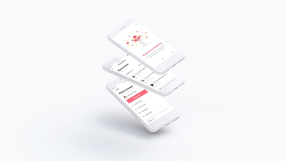
On top of the library I designed the features the expansion depended on: the supplier profile management page, the task centre, and the individual service introduction pages.
The result: design and development cycles both got faster. Two front-end developers built directly from the library, and a designer who joined later picked it up and shipped new pages from it without me — every new page on-brand by default. The library outlived my involvement, which is the only real test of a design system.